
Implementing a light/dark mode toggle with pure JS/CSS


Coding Jan 4, 2022
Statically generated websites are great, but for some things you still need some minimal JS running in the browser. Let's take a look at how to implement a minimal light/dark mode toggle in Eleventy.
What's the goal? 🔗
We want to have a button that toggles between light and dark mode on click. Initial visitors should see the site in dark mode. After a toggle, upcoming visits will remember the mode and show the site in that respective mode. The toggle button should represent the current mode and, on hover, indicate the toggle to the other mode.

In a nutshell, how do we get there? 🔗
We remember the mode with a local storage variable light-mode. If set with any value (we use "set"), then light mode is active. If the variable does not exist, then dark mode is active. On toggle button click, the variable in the local storage is created or removed. On each page load, the variable is read and if set, leads to a CSS class .light being set on the :root element. Some CSS rules lead to several CSS variables being populated with different values if :root.light is set. Also, the representation of the toggle button itself is changed via CSS rules if :root.light is set.
So what's the code? 🔗
The toggle and logic goes into a Nunjucks file theme-switch.njk. This file is included where it should appear on the page. In this case, it's the header of the site.
<style>
  {% include "_includes/theme-switch.css" %}
</style>

<button type="button" class="theme-icon">
  <i
    aria-hidden="true"
    class="fas fa-moon"
    title="Toggle between dark and light mode"
  ></i>
  <i
    aria-hidden="true"
    class="fas fa-sun"
    title="Toggle between dark and light mode"
  ></i>
  <span class="sr-only">Toggle between dark and light mode</span>
</button>

<script type="text/javascript">
  {% include "_includes/theme-switch.js" %}
</script>
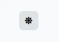
The HTML structure contains the toggle button with a sun and a moon icon indicating light mode and dark mode and an alternative text for screen readers. We use Font Awesome icons, but you can also use own or different icons to eliminate this dependency.
Some CSS defines the two themes with CSS variables. The :root element refers to the html element on web pages.
:root:not(.light) {
  --background-color: #044965;
  --primary-color: #05668d;
  --font-color: white;
  --secondary-font-color: rgba(226, 232, 240, 1);
  --box-shadow: 0 4px 6px -1px rgba(0, 0, 0, 0.1), 0 2px 4px -1px rgba(0, 0, 0, 0.06);
}

:root.light {
  --background-color: #f8f9fa;
  --primary-color: #dee2e6;
  --font-color: #212529;
  --secondary-font-color: #495057;
}
The CSS styles the toggle button itself to have some fixed width and height, a bit of color, border and box-shadow as well as a Flexbox to center the visible icon vertically and horizontally. Also, it changes the visible icon depending on the selected theme. If the dark mode is active, then the moon should be shown. If the light mode is active, then the sun should be shown. We use the display property and the CSS selectors :root.light and :root:not(.light) to achieve that.
.theme-icon {
  width: 2.5rem;
  height: 2.5rem;
  box-shadow: var(--box-shadow);
  border-width: 1px;
  border-style: solid;
  border-radius: 0.5rem;
  border-color: rgba(226, 232, 240, 0);
  background-color: var(--primary-color);
  display: flex;
  justify-content: center;
  align-items: center;
  cursor: pointer;
  font-size: 1em;
}

:root:not(.light) .theme-icon .fa-sun {
  display: none;
}

:root:not(.light) .theme-icon .fa-moon {
  display: inline-block;
  color: white;
}

:root.light .theme-icon .fa-sun {
  display: inline-block;
}

:root.light .theme-icon .fa-moon {
  display: none;
}

.sr-only {
  height: 1px;
  width: 1px;
  overflow: hidden;
}
The JavaScript needs to achieve two things:
- If the toggle button is clicked, then the theme should be toggled and the setting should be persisted into the local storage.
- If the page is loaded, then the setting should be read from the local storage and the theme should be set.
We have two functions toggleRootClass and toggleLocalStorageItem to change the currently shown theme and to persist the setting into the local storage. On button click, both of these functions are called. On page load, only the root class is toggled since the setting doesn't change in this situation.
function isLight() {
  return localStorage.getItem("light-mode");
}

function toggleRootClass() {
  document.querySelector(":root").classList.toggle("light");
}

function toggleLocalStorageItem() {
  if (isLight()) {
    localStorage.removeItem("light-mode");
  } else {
    localStorage.setItem("light-mode", "set");
  }
}

if (isLight()) {
  toggleRootClass();
}

document.querySelector(".theme-icon").addEventListener("click", () => {
  toggleLocalStorageItem();
  toggleRootClass();
});
Conclusion 🔗
With some minimal CSS and JavaScript, it is possible to implement a lightweight dark and light mode toggle without introducing a big third-party dependency.